Newman house
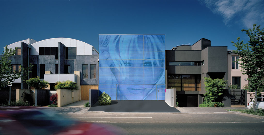
The Newman house is actually a most subtle and sophisticated design for a first work, in which Post-modernism co-habits seamlessly with Minimalism. Cassandra uses Robert Venturi’s term ‘billboard façade’, for her art-work actually named ‘White Noise’. She experimented with over 20 patterns to obtain such subtlety, printing full-sized versions of the pixelations. The façade is manufactured from laminated glass, digital film and an aluminium flat plate grid frame. Varying light, reflections, shadows, direction and distance, all contribute to the depth and density of the image, sometimes disappearing into non-figurative patterns. She began by looking at the work of Australian artist Geoffrey Smart, known for his highly coloured images of figures placed in bleak urban settings.
The tiny site measures just 20 x 9metres, half now occupied by the house, on a difficult south-west, north-east orientation: the south-west faces busy Canterbury Road and north-east fronting Albert Park across the railway line: noise and danger intrude on both fronts. Cassandra was given an entirely open brief: a rare luxury, particularly for a first commission. Only a sense of the exotic, light and privacy were mentioned as requirements.
Her client was such a popular figure; she determined to cast her design net over popular culture. She values action into the public space, by speaking in popular language, superimposing a flat image over the architecture, a gesture at once beautiful, subversive and confrontational. It became a design objective to get (her) architecture on the front page of the Herald Sun, and that she did, twice. That does not commonly happen these days. Architecture no longer determines the parameters of public life. It is commonly too cerebral for that.
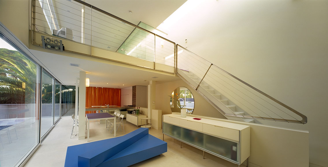
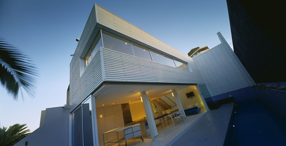
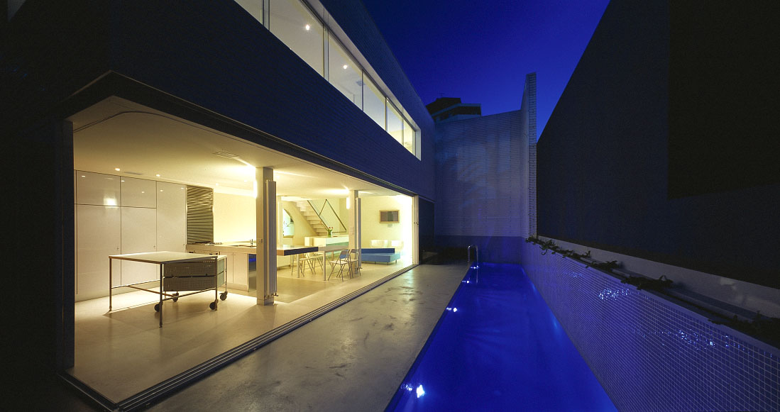
Of the three levels of the Newman house, ground seems to be taken by parking and utility, expressed as a solid plinth. The two upper levels float above, set well back from boundaries in a fresh interpretation of the typical sensible Melbourne suburban siting, to let cross-ventilation allow the building to breathe. The entire north-western elevation opens, as vast glass screens glide away. An open-plan dining/living space opens onto an entertainment platform and lap pool. Yet there is a reassuring feeling of safety from an intrusive world beyond.
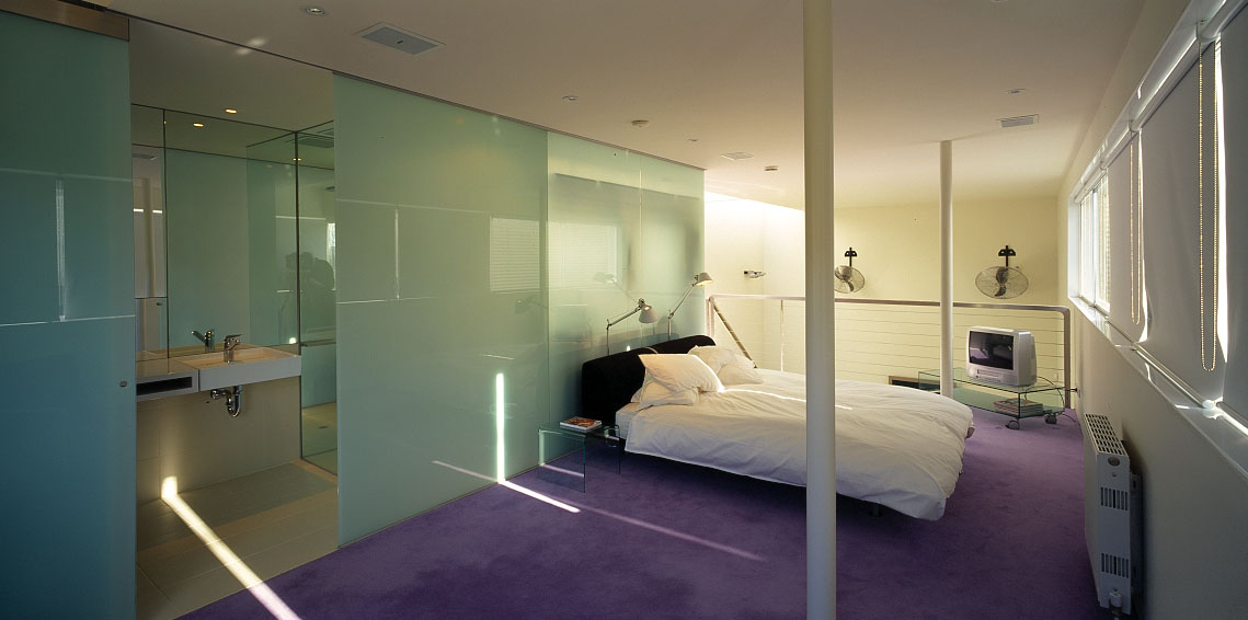
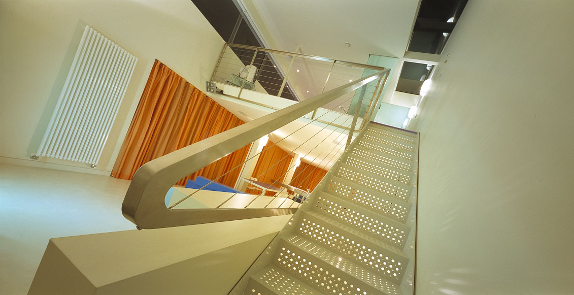
The corrugated, studded, fibreglass walls on the park facade are lined with pink bats, which in the morning sun, glow with a pink fleshy tone (suggested to the press as reminiscent of Anderson’s blouse). The stair glows through orange perspex. It is formed with continuously folded perforated steel, leading to the mezzanine bedroom above. Box forms encase both the ensuite and robe within opaque walls, and also kitchen storage.
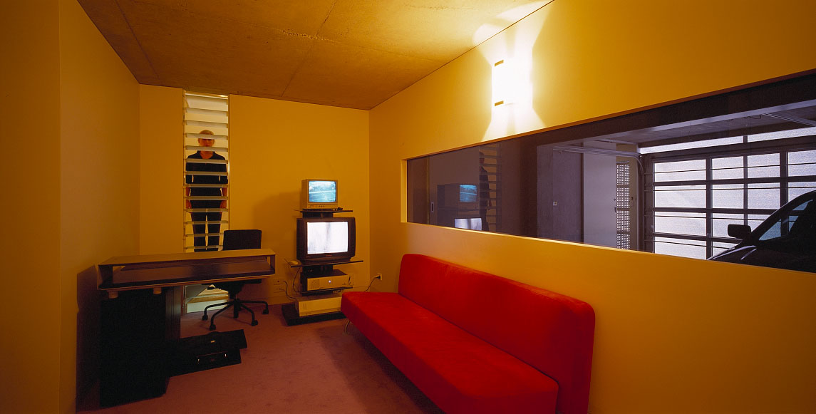
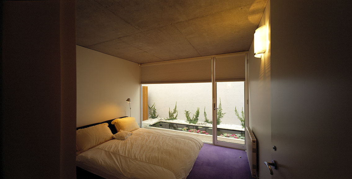
The colours are almost edible, reminiscent of jelly beans. Pinks, aquas, oranges, purples and yellows appeal to Cas-sandra. ‘We’re drawn to things we enjoyed as children, the plastic and glossy things that we put in our mouths’. In the Newman house, these contrast with hard, modernist materials like concrete, corrugated steel cladding, steel frames and louvres. Such refinement of detail, considered spatial resolution, manipulation of light and ventilation, with such strong image-making is remarkable in a young designer.


